Identity
Identity System Guidelines
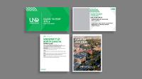
As stewards of the UND brand, it is our responsibility to uphold the consistent visual representation of the University’s image throughout all communication efforts. Consistent representation stretches across design style, color, typography, photography, video, and graphics.
Design Style
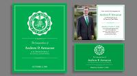
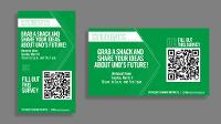
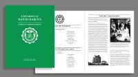
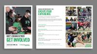
Our design styles can be classified as clean and modern. Less is often more.
- Reduce the use of overly saturated and busy backgrounds.
- Eliminate the use of special effects unless they are necessary for readability or part of brand standards.
- Use white or solid saturated colors from the UND color palettes.
- Transparency cannot be added to UND green that dilutes or lightens the color.
- Use simple typefaces from one of the recommended UND typefaces.
- Minimize copy and organize it based on your messaging goals.
- Format copy in bullets or use short lines or columns.
