Typography
Consistent typography elevates copy to a consistent visual representation for bold UND messages. UND has three main typefaces that will help bring visual interest to our work, all while reinforcing our brand.
Brand Fonts
Licensed Typefaces
Design professionals employed by UND should use our licensed typefaces:
- Trade Gothic Pro Bold Condensed #20
- Dejanire Headline (Medium and Bold)
- Helvetica Neue (Roman, Italic, Bold, Bold Italic)
Licensed typefaces are provided after a designer completes brand training.

License-Free and Libre Typefaces
UND stakeholders without access to the licensed typefaces can substitute them with these comparable fonts, which do not require purchased licenses.
- Substitute Trade Gothic with Oswald Medium
- Substitute Dejanire Headline with Nimbus Roman
- Substitute Helvetica Neue with Arial

Other Typefaces
- Friz Quadrata: Only for use in the UND Logo System.
- Helvetica: For use in directional and wayfinding signage.
- Serif fonts: Baskerville and Cardo for use in formal communication.
- Magazines: Magazines may require the use of different fonts. If you are unsure which font to use, contact identity@UND.edu.
Typography Usage
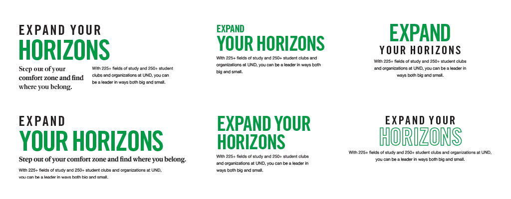
While our typefaces can be arranged in multiple ways, it is important to maintain the proper hierarchy. Our headlines are concise and bold. They use Trade Gothic set large and tight. Smaller, looser contextual headline copy is used as needed. Dejanire Headline is a second-tier type that can be added to emphasize important copy. Lastly, large sections of body copy use Helvetica Neue set with spacious leading.
For more direction on how to use our fonts and set paragraph/character styles, complete brand training.
